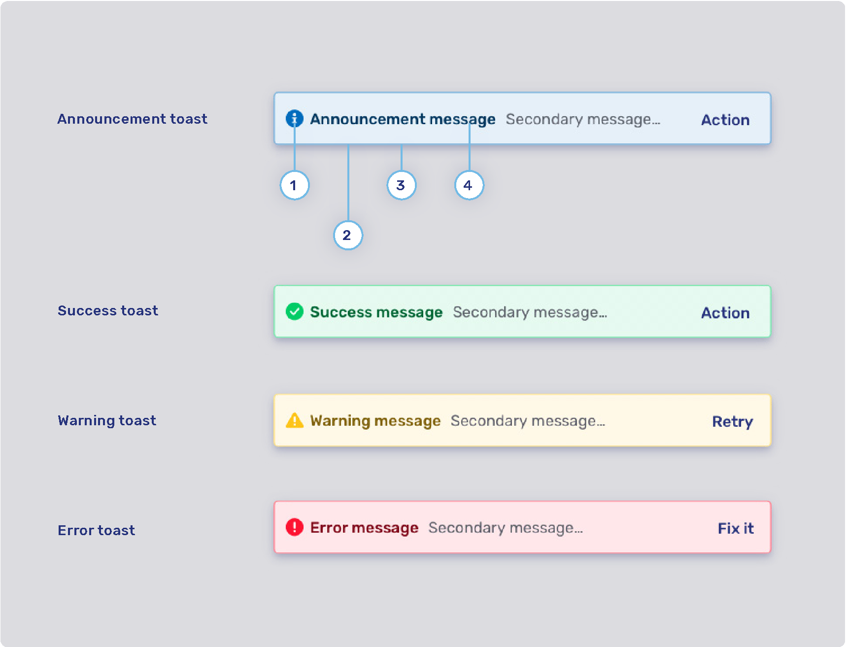
General theming
The configuration properties on this page affect all Unblu UIs.
Colors
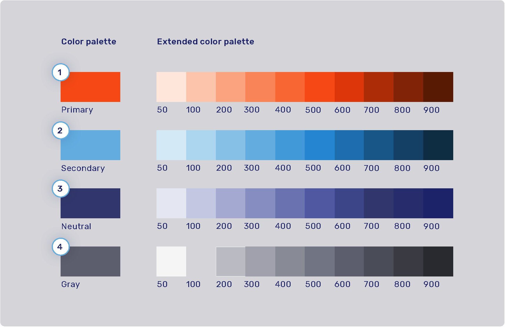
The product color palette is defined by four main colors: primary, secondary, neutral, and gray. Each of these colors has an extended color palette composed of varying degrees of saturation/brightness which can be used throughout various elements of the user interface.
-
Primary palette: com.unblu.theme.color.primary
Extended primary color palette:
-
Secondary palette: com.unblu.theme.color.secondary
Extended secondary color palette:
-
Neutral palette: com.unblu.theme.color.neutral
Extended neutral color palette:
-
Gray palette: com.unblu.theme.color.gray
Extended gray color palette:
Feedback colors and secondary color map
-
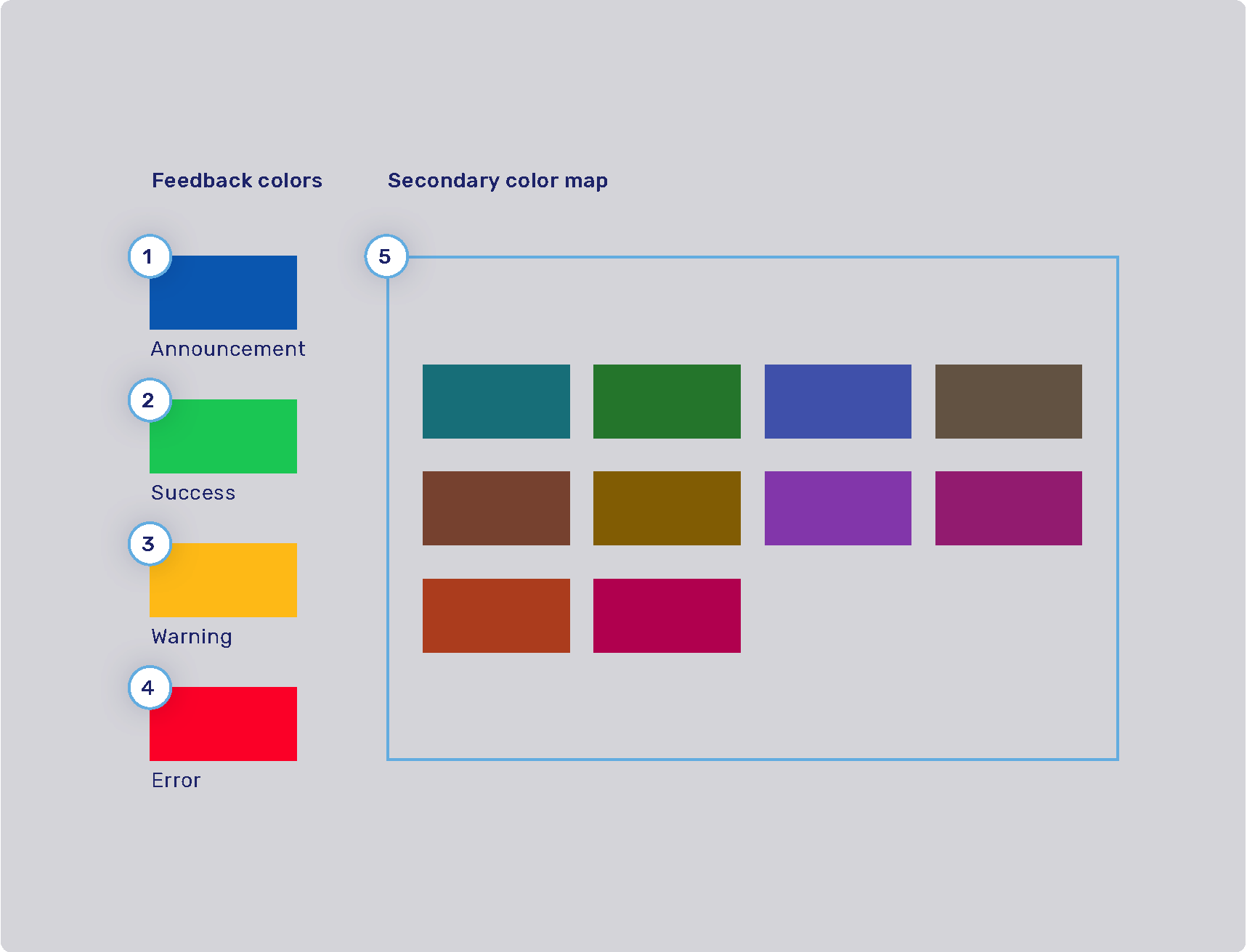
Announcement highlight color: com.unblu.theme.color.announcement
-
Success highlight color: com.unblu.theme.color.success
-
Warning highlight color: com.unblu.theme.color.warning
-
Error highlight color: com.unblu.theme.color.error
-
Secondary color map: com.unblu.theme.color.secondaryColorMap.
Colors used for secondary elements such as avatars and virtual mouse cursor labels are chosen randomly from a set of colors determined in the configuration key above.
The info toasts for the various feedback types are configured separately. Refer to Info toasts below.
Font
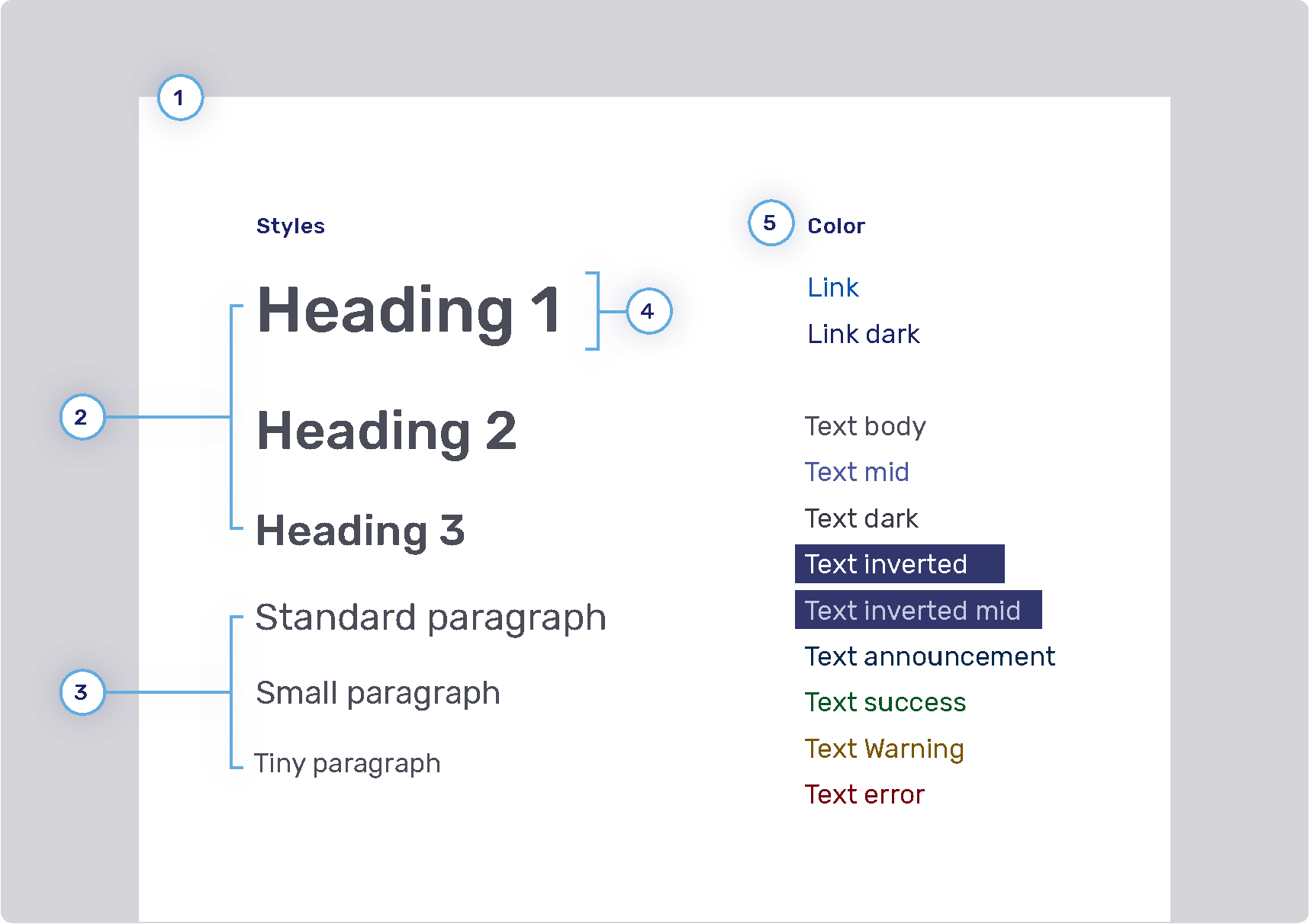
You can configure the size, color, and weight of text, but you can’t configure its placement in the UI. For example, if the UI uses a header 1 style, you can’t change it to header 2.
-
Font family
-
Headings
-
Weight
-
Sizes
-
Heading 1: com.unblu.theme.font.heading1Size
-
Heading 2: com.unblu.theme.font.heading2Size
-
Heading 3: com.unblu.theme.font.heading3Size
-
-
Color
-
-
Paragraphs
-
Sizes
-
Standard: com.unblu.theme.font.paragraphSize
-
-
-
Font line height
-
Font color
-
Link
-
Text
-
Inverted: com.unblu.theme.font.colorTextInverted
-
Inverted mid: com.unblu.theme.font.colorTextInvertedMid
-
Announcement: com.unblu.theme.font.colorTextAnnouncement
-
Warning: com.unblu.theme.font.colorTextWarn
-
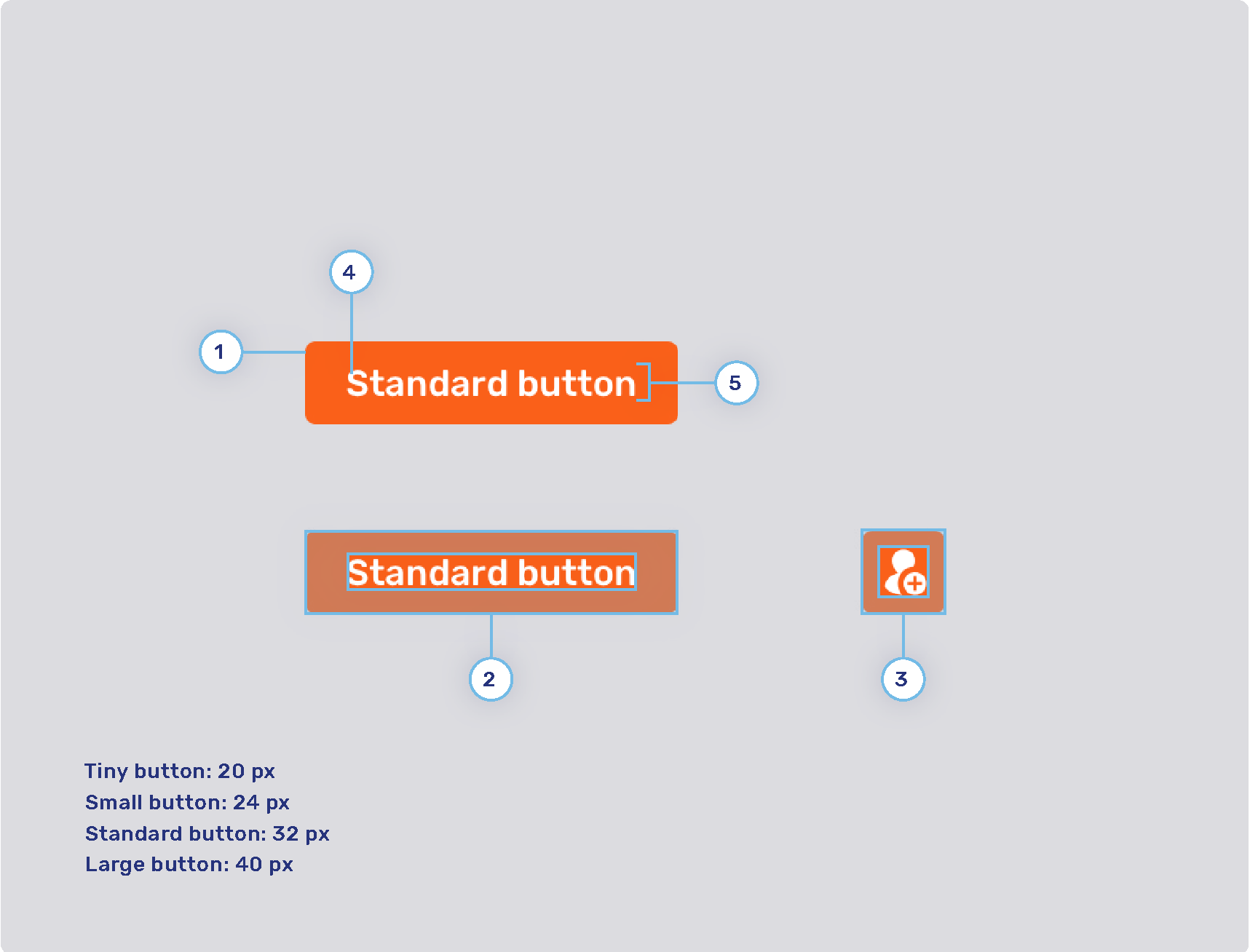
Buttons
-
Radius
-
Button padding
-
Tiny button
-
Small button
-
Standard button
-
Large button
-
-
Icon button padding
-
Tiny button
-
Small button
-
Standard button
-
Large button
-
-
Font weight
-
Line height
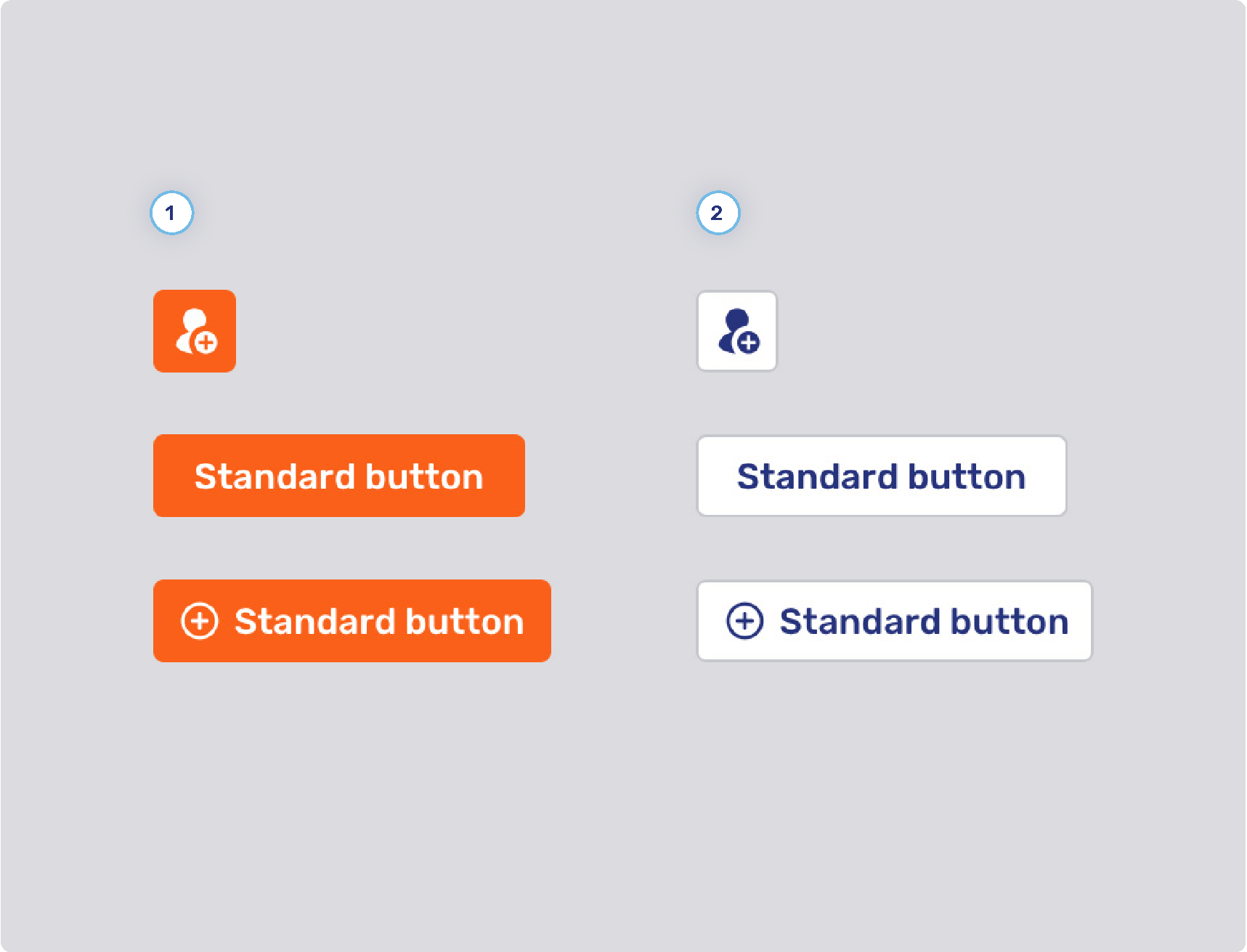
Primary and secondary buttons
-
Primary button style
-
Background states
-
Border width
-
Border states
-
Foreground states
-
-
Secondary button style
-
Background states
-
Border width
-
Border states
-
Foreground states
-
-
Other
-
Minimum button width
-
com.unblu.conversation.messaging.ui.multiChoiceButtonMinWidth
This configuration property only applies to buttons for multiple choice questions.
-
-
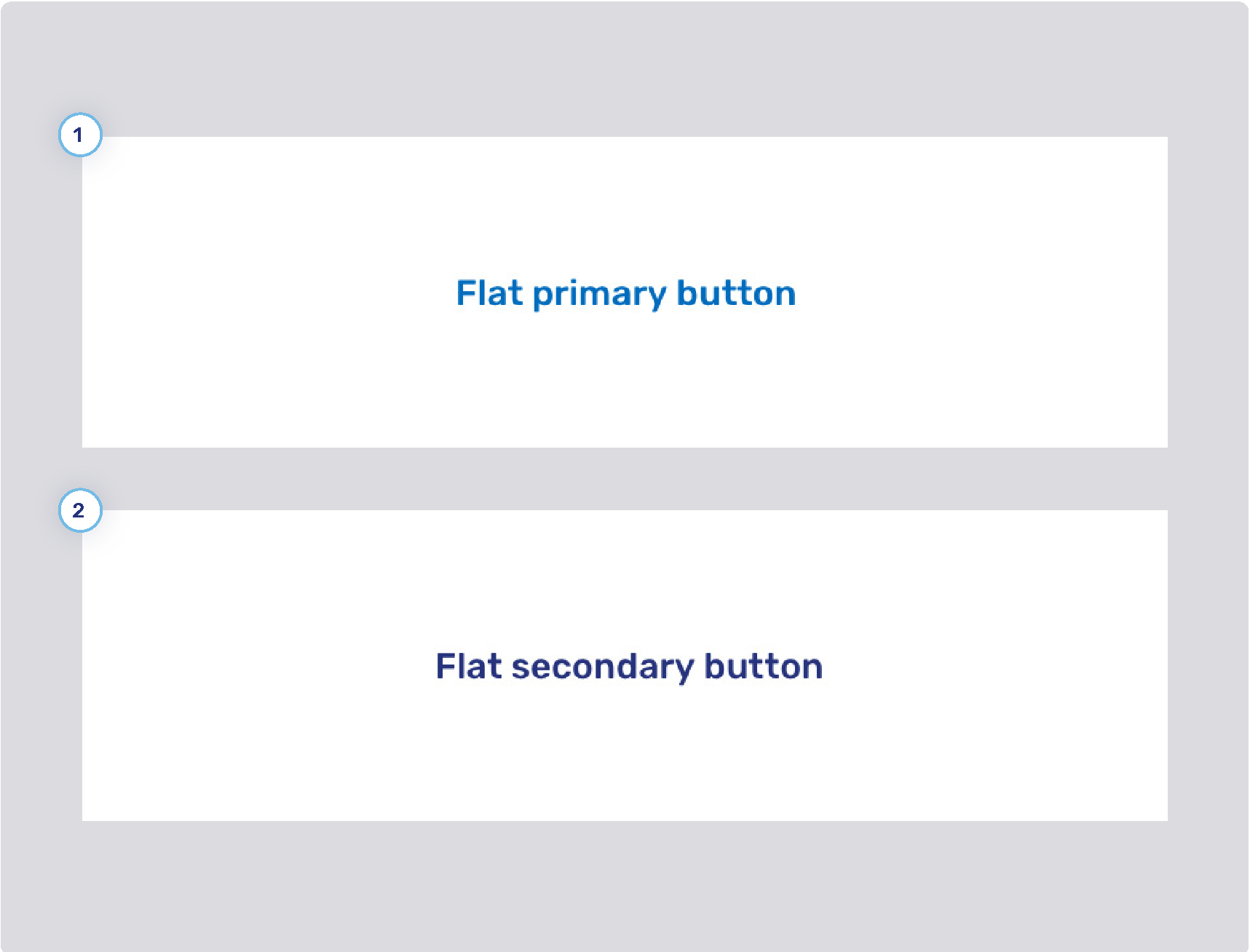
Flat primary and secondary buttons
-
Flat primary button style
-
Background states
-
Border width
-
Border states
-
Foreground states
-
-
Flat secondary button style
-
Background states
-
Border width
-
Border states
-
Foreground states
-
Flat inverted buttons

-
Background states
-
Border width
-
Border states
-
Foreground states
Toggle buttons

-
Background states
-
Border width
-
Border states
-
Foreground states
Flat toggle buttons

-
Background states
-
Border width
-
Border states
-
Foreground states
